Last year I wrote about smartphones as enablers of antisocial noise levels:
Your phone helps you check out of the uncomfortable situation. That’s why when there’s a disco, the seated areas are aglow with phones.
Smartphones have lots of excellent uses, but I’m interested in a feature we never talk about: the smartphone as a sign that something is broken. There are times when the use of a smartphone signals that something is wrong just as clearly as a dead canary being hauled out of a coalmine. For example: how many times have you used your smartphone for train information, when you’re standing in the station? You use it because it’s a quicker and easier source of the information you need than the station staff, or the live departure boards, or the timetable information displayed in the station.
Another example: I have a friend who uses her phone’s GPS to track the route when she’s on a bus she hasn’t caught before. Why? Because it’s a better source of route information than anything you’ll find on the bus itself. I’m not criticising the completely rational individual choice to use your smartphone for travel information. I’m just looking at what that means for people who don’t have the privilege of being web-literate, being able to afford a smartphone with a mobile data package, being able to use a phone without hand or wrist pain. For people without all that privilege, the train station’s information systems are broken and that glowing rectangle in your hand might as well be a dead canary.
If providing a positive user experience was the priority for the organisations who provide bus services, all buses would have London-style stop announcements. If information about all the stops on a route is available on a screen and each stop is announced by a recorded voice, how many people will be whipping out their smartphone for GPS info? A bus route where nobody needs a smartphone is a bus route where people without smartphones don’t need to neurotically squint out of the window, rely on the kindness of drivers or risk missing their stop. It’s a route that people can use for the first time without feeling anxious, which means it’s a route that’s welcoming to new users.
If providing a good user experience was the priority for the organisations who run our trains, we’d get the information we need much further in advance. The current system involves displaying as many forthcoming departures as will fit on a fixed number of screens. In busy stations, that could mean less than half an hour ahead. Twenty minutes or so sounds like enough time until you’ve actually been in the position of catching a train at a large station for the first time.
This year I went to Amsterdam for the first time. My journey home started with catching a tram from the conference centre to Amsterdam Centraal station. I went through what looked like the main entrance, expecting a grand plaza-style station concourse, and was surprised to find a few small shops and two small information screens. I wasn’t sure I was in the right part of the station. And my train wasn’t showing up on the screens yet. I thought of going to look at the platform-specific departure information, but when I wandered towards the platforms I realised there were at least ten of them and they all seemed to be up a flight of stairs. I struggle with lifting heavy cases at the best of times, thanks to RSI, and this time my hand was bleeding as well, so I was even more reluctant to lug the case up and down ten flights of stairs on the off-chance of getting my platform info sooner. But I also really wanted the chance to find out in advance where the damn platform was, because I was ill with a virus and moving more slowly than usual.
Finally, half an hour before departure, my train showed up on the “main” departure screens. Well, a Thalys train showed up. But this one was heading to Paris, and I was going to Brussels. On my way to Amsterdam, I’d come within a whisker of boarding the wrong Thalys, leaving at exactly the same time as the right Thalys, and I was frightened of doing the same thing again. I became even more alarmed when trains scheduled for after my own train started showing up on the screen, but there was still no sign of a Thalys train to Brussels.
I queued up for the information desk and a very snappy woman told me that the Paris train was the same as the Brussels train. Why couldn’t it just say that on the departure info screens? “Because it is too early. You are too early.” Apparently the details only appear within ten minutes of the train’s departure.
At this point, it was twenty minutes to departure. I was ill, sleep-deprived, carrying a heavy case, in a strange country, with a bleeding hand. But I was made to feel like a diva for wanting to know which platform my train was leaving from. Once I had that information I headed straight for the platform, but it took me another ten minutes or so to walk there and find the lift.
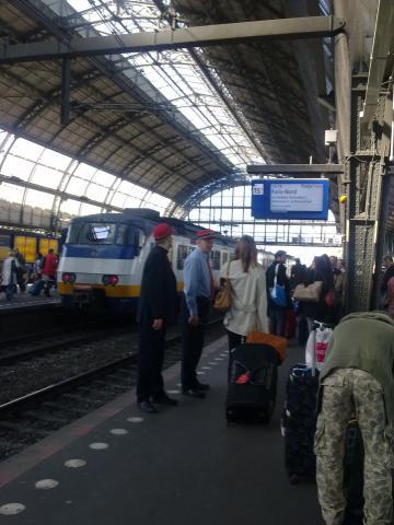
The platform was crowded when I reached it. Clearly the passengers who’d worked out which platform to use didn’t agree with the assessment that it was “too early” to know. There were two officials in hilarious caps putting us into groups according to which carriage our ticket was for. In other words, there was a perceived need at this point to get passengers on the platform organised, but no perceived need to actually tell potential passengers which platform to use.
It seems very likely that the Thalys for Brussels almost always leaves from the same platform at Amsterdam Centraal. In other words, there’s a two-tier system where people familiar with the station and the journey have the luxury of heading to the platform in a leisurely manner, while new users of the station are deemed to be “too early” and must wait and wait and wait, then run.
Presumably the full platform info did finally appear on the departure screens downstairs; I don’t know, because if I’d waited for it I might have missed the train. And I’m aware that despite the virus and the bleeding hand and all the rest of it, I still had a massive stack of privilege on my side: I can walk unaided, I was helped by English-speaking people, I wasn’t travelling with a toddler in a buggy or a friend with disabilities.
I wrote in my post on empathy and usability that organisations don’t need to care, they just need to act as if they do. Likewise, organisations don’t need “common sense”, they just need to gather data on user behaviour.
You don’t need to understand that uncertainty is stressful and offputting, or that passengers can’t relax if they’re not sure they’re in the right place. You just need to look at when passengers with the privilege of smartphones and/or familiarity with the route are heading to the platform. You can then take an educated guess that other people would like to go to the platform at roughly the same time. People who don’t want to go to the platform that early will still appreciate the information that their train is on time (or not).
Of course train departure information is subject to change right up until the last minute (and beyond) and there are limiting factors. But one limiting factor can be removed: the number of screens available. Why allow that to be an arbitrary cap on the information available to people in the station? We have a mean culture in our train stations that says two screens will do; why not be generous instead, and have three? Or if it’s a really busy station which already has three, why not go for four? It’s easy to tell when you have enough information screens: all the smartphones in sight will be used for fun things like games or tweeting rather than for basic information that should be available to everybody. From dead canary to Angry Birds: all it takes is a bit of user-focused thinking.
Comments
Kate That's a really
Kate
That's a really interesting point. And it reminds me of the time I was told off by a Chiltern Railways employee for boarding a train at Marylebone based on the information from Chiltern's own web site when the information hadn't been posted on the station notice boards.
Many years ago (pre-web - this would have been about 1989) I was thinking about a hypertext system that monitored the times that people clicked on links in various contexts, to create a sort of landscape of connections. I was thinking of this in the context of legal research. Imagine the path from link to destination being a the course of a river, and following a link sent a drop of water down that river (and causing a tiny bit of erosion on the way). After a while, a sort of river-system would emerge, with the most frequently followed links creating the biggest rivers, and you could choose either to go (quasi-literally) with the flow, or to follow your own less-travelled route. Needless to say, privacy wasn't an issue when I thought about this.
Anyway, it occurs to me, in a similar vein, that it would be really interesting to have an app (again, privacy issues ignored for the time being), which could monitor which websites were most frequently looked up at certain locations, or were currently being looked up. If you were in a station, then you'd doubtless see live train information, and also information about the immediate local area etc. The station itself could display the top 5 hits on screens scattered around the place, which would automatically help to provide people who didn't have access to smartphones, with the same information that people around them are looking up. (It would also provide comprehensive hacking fun). It would also be useful in a number of other contexts - I was listening to a particularly dull operetta the other day, and the organisers hadn't thought to provide a comprehensive programme, so I tracked down the score for the same piece on my smartphone and managed to use it to figure out how much longer the caterwauling was going to go on for. It would have been nice if that site had appeared on a top-5 list for that location that evening, so other people in the audience could have seen it.
Just a thought.
- Andrew
Are they still doing building
Are they still doing building work at Amsterdam Centraal station? I'm fairly sure at least some of the big Dutch stations have a large display board with trains for the next few hours, I wonder if it's just that no-one thought about non-regulars when planning the interrim arrangements during the building works?
I also seem to recall that there is more than one passageway underneath all the platforms. I'm pretty sure one of them did have escallators, and another (or was it the same?) had a lift. My hunch on that part of your problem is that the good work on accessibility to the platforms was let down by poor/no signs directing you to the "regulars / able bodied" subway rather than the "main" one.
There are disadvantages of sending passengers to a platform too early though, as you may have spotted yourself at Oxford on Platform 2 from time to time. Because of insufficient display screens and coverage along the whole length of the platform, you get everyone clustering in one place. If too many trains worth of people get there early, there just isn't room for them to wait, and they get in the way of people trying to board/alight services before theirs. Add in a little delay (which let's face it, there often is), and you also see people getting onto the wrong train.
Long term, the fix is to knock down stations that aren't big enough for their passenger numbers (eg Oxford) and rebuild them to a sensible size. Short term I think they've taken a punt on the least-worst way to handle the conflicting pressures. If you think they've got that balance wrong, I'd suggest you try a "Meet The Managers" session, and explain to them there what you think they should do differently, and what cheap things they should do to improve it (eg add more screens). Customer Services will ask for 50 pieces of information, then ignore you. "Meet The Managers" is a rare chance to speak to people who both care and have the power to fix small and medium things. In my experience, they genuinely don't know what the problems are...
Nick, the point of this post
Nick, the point of this post - the point of many of my posts - is that systems and organisations can disadvantage certain groups without actually meaning to. The possibility that "no-one thought about non-regulars" is entirely likely, but that's a cause of poor usability, not an excuse for it.
I think you and I have fundamentally different views on life. Mine is that if you have a situation where people who don't have the advantages of technology, fluency in this or that language, high intelligence, familiarity with the area and so on are at a bigger disadvantage than they need to be, you should change the situation. I want trains, shops, websites that are usable by people who are a bit thick, stressed out, slow at walking, not fluent in the local language, whatever. And you get that by starting with the experience of those people, by testing with those people in mind. You don't get it by putting yourself in the place of the people who create and maintain these failing systems and making excuses for them.
Maybe there were some lovely escalators that I could have used if only I'd known they were there. But can you understand that from my point of view, the actual existence of the escalators made no difference whatsoever? I didn't know they were there, so I couldn't use them. Again, the lack of signs is not something that lets down an otherwise great user experience - it's something that caused a bad user experience. Poor information about facilities = poor facilities, as far as the user is concerned.
The specific example of
The specific example of Platform 2 at Oxford: it's not big enough, as you say. Which means people cluster there and it gets too crowded. But if you try to solve that problem by withholding information from some passengers, you're making a decision about who gets a place on the platform and who doesn't. I've used the station many times before and already know Platform 2 is the likely one for northbound trains. The current system means that I get to clog up the platform well in advance whereas a stranger to the station has to wait. How is that a fair or reasonable way of managing platform demand? It's nothing to do with needs (e.g. anxiety disorders, mobility problems, whatever) and everything to do with smoothing the way for people with certain privileges. It's not intentional but that's the result.
A user-focused approach would find different ways to stop everybody heading to the platform too early. My instinct is that a lack of information and the generally mean atmosphere of stations makes people jumpy, which makes them early. Build in some reassurance and you might change behaviour that way. A guarantee that trains will NEVER leave early would be a start, but ultimately you'll need a bigger platform and/or more non-platform space for people to wait in. More seats. Put back the clock that they inexplicably removed from Platform 1 - maybe being able to look up and instantly see what time it is makes people less jumpy about waiting, less likely to head to the platform stupidly early. Maybe good, reasonably priced coffee and somewhere to sit and drink it has the same effect. Maybe a sign asking people not to head to the platform too early would help. I don't know, but you can find out what works through user testing.
Some fixes are expensive,
Some fixes are expensive, some are cheap. Cheap fixes should be done, expensive ones should be planned for (or a workaround put in place). Someone does need to think about them though, I agree!
Have you tried Reading station recently? It's still short a few monitors and signs, but they do seem to be fixing those. "In Progress" platforms can be a bit of a nightmare, but the completed ones do seem to be a lot lot better than what was there before - more space, more display boards, more seating etc. The overall project hasn't finished though, so now would be a good time to get in touch with the appropriate + empowered managers, to suggest they do the kind of usability testing that you recommend!
Some of my public transport travel is as a near-regular, but quite a lot of it is in foreign countries with luggage when tired, so I do experience both sides! The station manager at Amsterdam Centraal ought to see how they do the platform signs in Hong Kong - that was excellent for giving directions to lifts and stairs and escallators, so you could easily choose which to go for and where to go. Seville and Barcelona are both on my naughty list - I missed trains and buses in both cities due to missing and misleading maps and signs. Lille is very good about lifts for people with bags / mobility problems / push chairs etc, but my problem there was that the ticket / smart card reader by the lift in several stations was broken, and all the other ones were on an intermediate floor not served by the lift. One machine is never enough, as it will eventually break, and what then?
In most cases, there has been no obvious effective way to report the problem, so I just grumble and move on. I rarely even blog / tweet / write about it, so I'm not as good as you. In one or two cases, I do know the trick for getting through to the right person. FGW - meet the managers sessions at stations, which are infrequent, but announced in advance - http://www.firstgreatwestern.co.uk/About-Us/Customer-services/Meet-the-Manager . Network Rail, for Paddington and Kings Cross (plus a few select others) do also have Meet The Manager sessions, but I've had less luck with those. For TFL, I've had issues with the tube gatelines rejecting valid tickets. An online complaint was painful (asking for lots of specific details for a general problem), but eventually it did get routed to someone who knew what they were talking about, who asked me to send one physical ticket that failed, which they confirmed the problem with. Problem still exists though, but I have some hope it'll get fixed in the end, now that the right person knows about it!
Thanks very much for this
Thanks very much for this comment, Andrew. (My first thought: you must have been a very gifted teenager!) I love the idea of an app displaying what people are looking up on their smartphones. Maybe you could get round the privacy thing by offering free wifi on condition that what you look up is included in this publicly-available data. Most "free" wifi on public transport is actually more intrusive than that already, requiring name, address and inside leg measurement (and then not working anyway). Of course, if you have the screens to display the top five sites visited then you also have the screens to display the train information in the first place...and maybe you could use them for that very purpose when your experiment/art installation is over.