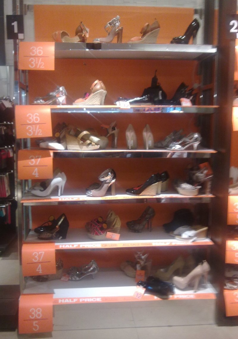
Take a look at this photo of a summer shoe sale at Next.
For the benefit of people who’ve never bought shoes in the sale: it’s the norm for sale shoes to be organised by size rather than by style. That’s basically because all the sale stock is out on the shelves, so there’s no point finding a shoe you like in the wrong size and then asking if they have it in a 5. They won’t. It’s a jungle out there.
I think the practice of organising sale shoes by size is great, an example of good usability. It’s also a way of imposing some order on a situation which can turn chaotic quickly. I also like the signs helping you to spot the shelf you need from a distance and make a beeline for it. (Those signs will also help shop staff put shoes back on the right shelves when they’re tidying up at the end of the day.)
So why is this post in the “real-life tales of usability fail” category? Because of the order in which the sizes have been categorised. Look at the picture again and see if you can spot the problem.
My own shoe size is usually 3 ½. My 5’ 1” height is roughly in proportion to this. (At least, I assume it is. I’ve never heard any comments about how huge my feet are compared to the rest of me.) This means that it’s a struggle for me to reach the top shelf in that picture – the shelf where all the shoes in my size have been placed. I can just about reach the shoes right at the front of the shelf, but if I want to go further back I’m going to have to clamber up there, using the size 4 shelf as a foothold.
If you’re ordering shoes on shelves by size, it seems pretty logical to start with the smallest size and work up to the largest. And because we read English from left to right and from top to bottom, it also seems logical to start on the top left shelf and work downwards, then start again on the next set of shelves. It’s logical until you bring usability into the equation. It’s logical unless you’ve actually had the experience of being a woman with size-3 ½ feet who can’t browse the sale because she can’t reach the shoes. This is yet another example of why usability and user testing is so important, not just in the technology world but in every situation where you’re designing an experience for other humans.
